10 Exterior House Colour Ideas to Boost Curb Appeal
First impressions matter, and your home’s exterior is the handshake before anyone steps inside. But choosing the right color combination can feel overwhelming. Do you play it safe with beige? Go dark and dramatic? What about that blue-grey you saw on a neighbor’s colonial? The wrong choice can date your home or clash with the roofline, while the right palette adds value, character, and pride. Whether you’re planning a full repaint or a simple refresh, these ten exterior house colour ideas will inspire you to pick a scheme that works with your architecture, landscape, and personal style. Let’s turn that curb appeal into a conversation starter.
1: Warm White with Natural Wood Accents
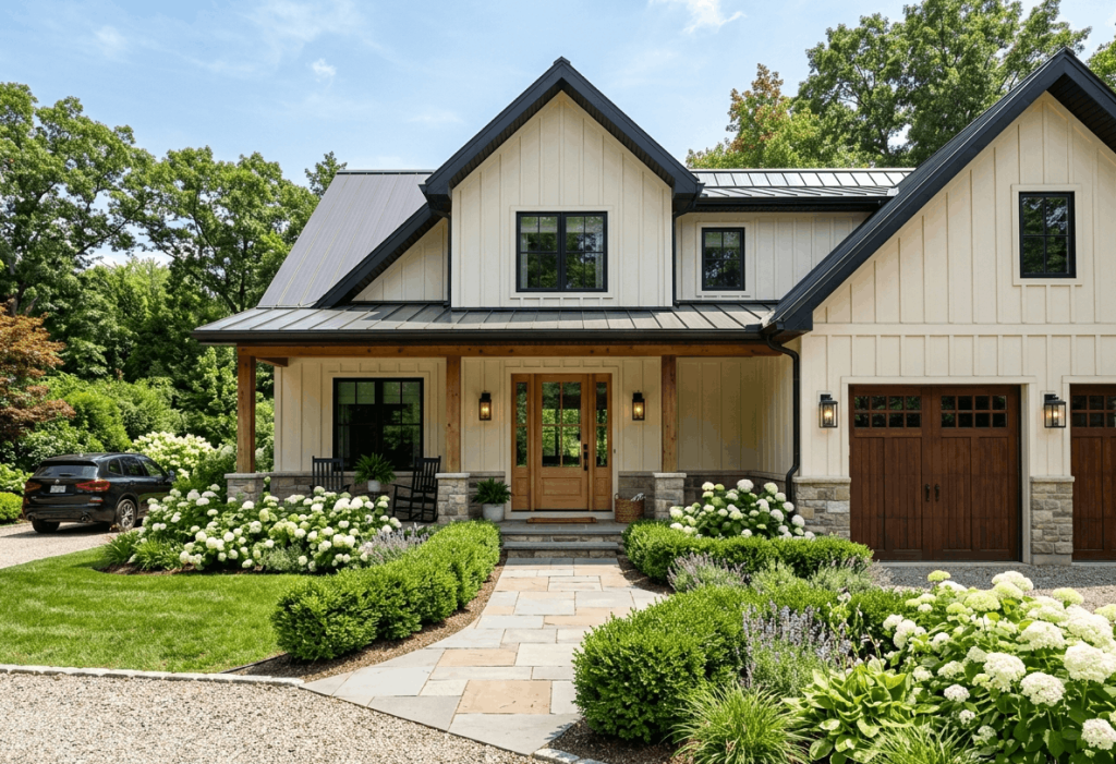
Crisp, warm white siding creates a clean, timeless backdrop. When paired with natural wood elements like a stained front door, exposed beams, or garage door cladding the look feels airy, organic, and effortlessly sophisticated. This combination works beautifully on farmhouse, craftsman, and modern transitional homes. The white reflects sunlight to keep the house looking bright, while wood tones add texture and warmth without overwhelming. For contrast, paint window trim in the same white and add matte black house numbers or light fixtures.
Tips
- Use a white with subtle yellow or red undertones (not blue) to avoid a cold, sterile look.
- Seal wood accents with UV-protective finish to prevent graying.
- Keep landscaping green and lush emerald shrubs pop against warm white.
2: Deep Navy Blue with Crisp White Trim
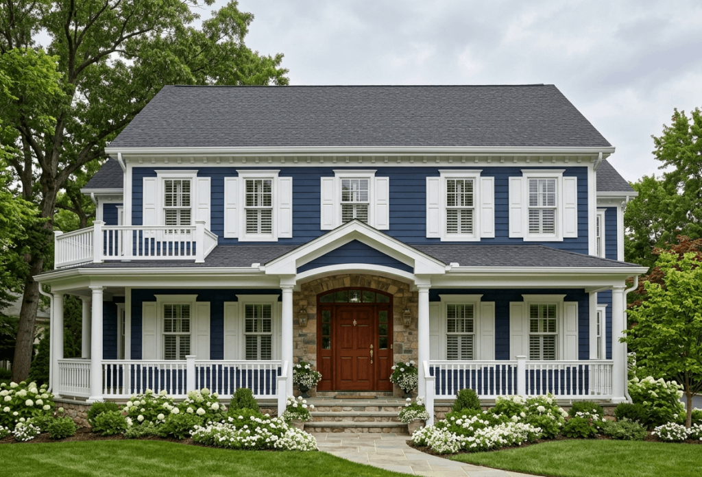
Deep navy blue is bold yet approachable, giving a home quiet confidence. This shade works especially well on coastal cottages, colonial revivals, and even modern minimalist boxes. Crisp white trim around windows, eaves, and columns creates a sharp, nautical contrast that feels both classic and current. A glossy front door in bright yellow or rich mahogany adds personality. Navy hides dirt better than light colors and makes surrounding greenery or autumn leaves pop. For roofing, stick with dark grey or black shingles to ground the look.
Tips
- Test navy samples in morning and afternoon light—it can read almost black on overcast days.
- Use matte or satin finish for siding, semi-gloss for white trim to reflect light.
- Add copper or brass house numbers and mailbox for warmth.
3: Olive Green with Cream Accents
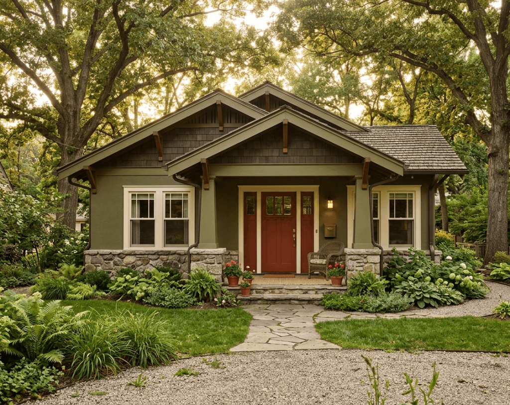
Olive green blends naturally with wooded lots, gardens, and stonework. It’s an earthy, calming choice for cabins, bungalows, and ranch homes. Cream or off-white trim keeps the palette from feeling too dark or military, while terracotta or brick red on the front door adds a rustic punch. This color feels timeless and slightly vintage, especially when paired with natural cedar shakes or stone veneers. Olive green also camouflages pollen, dust, and minor imperfections better than lighter neutrals.
Tips
- Pair with warm beige or cream, never stark white it will look jarring.
- Use dark bronze gutters and downspouts to blend with the green.
- Landscape with purple alliums or white daisies for contrast.
4: Charcoal Grey with Yellow Front Door
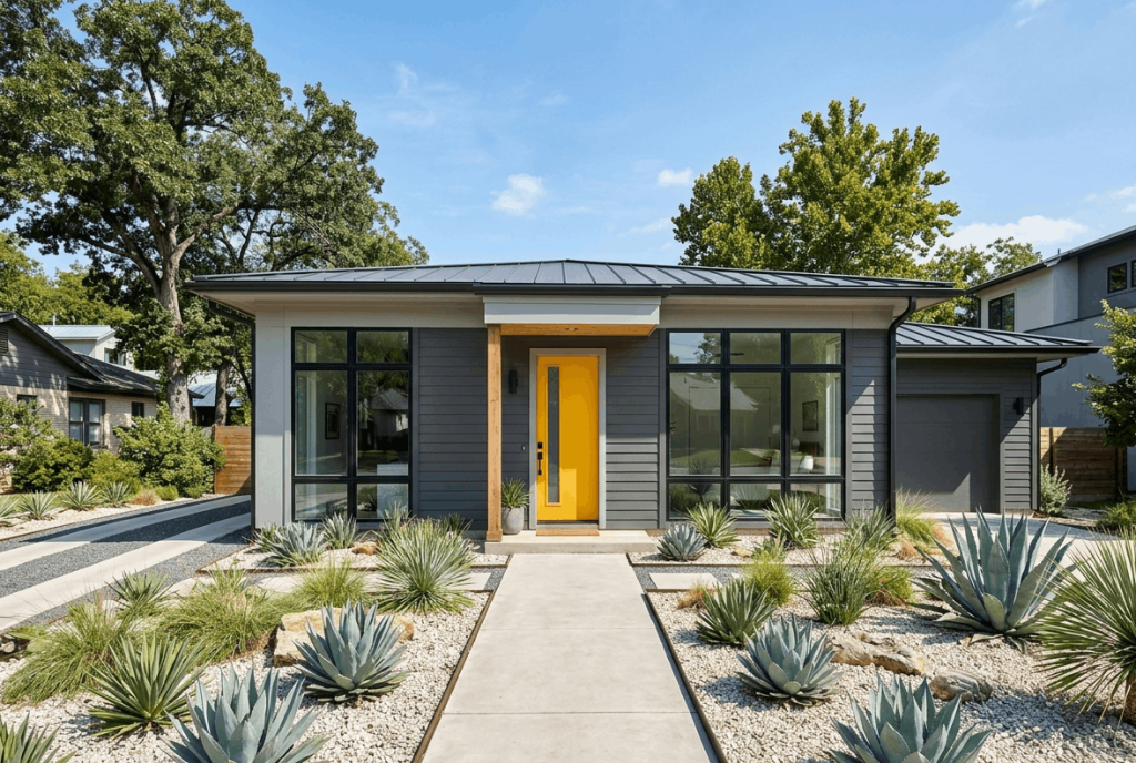
Charcoal grey is the new black sophisticated but softer. It works on contemporary, mid-century modern, and industrial-style homes. The dark grey absorbs light, making the house recede into the landscape, while a bright yellow (or mustard) front door becomes a joyful focal point. Keep trim simple: white or light grey for windows, and match the driveway and walkway materials (concrete or light stone) to prevent the whole scene from feeling too dark. Use large house numbers in polished silver or black.
Tips
- Choose warm charcoal (brown undertone) over cool charcoal (blue undertone) for wood-heavy neighborhoods.
- Paint the garage door the same charcoal so it doesn’t compete with the yellow door.
- Add warm white landscape lighting to highlight the front entry at night.
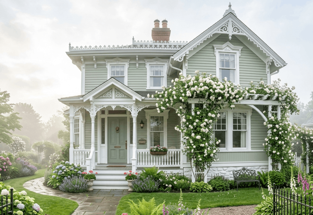
Pale sage green feels soft, restful, and slightly romantic. It’s ideal for Victorian houses, English cottages, or any home with detailed trim. Pair it with white or cream trim and add a white stone veneer on lower walls, pillars, or chimneys to anchor the look. This combination reflects natural light beautifully and makes small homes appear larger. Sage green also pairs effortlessly with brick, wood, or black metal roofing. For a subtle twist, paint the front door a slightly deeper sage or a soft lavender.
Tips
- Use semi-gloss on trim to catch light and emphasize architectural details.
- Avoid pairing with stark white windows use off-white or almond instead.
- Plant lavender, rosemary, or silver dusty miller to echo the muted tones.
6: Terracotta with Warm Beige Trim
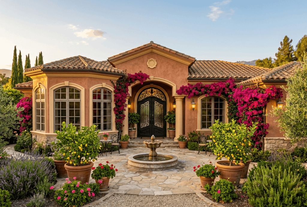
Terracotta brings Mediterranean, Spanish revival, and Southwestern homes to life. This warm, earthy reddish-orange feels inviting and timeless under strong sun. Pair with warm beige or sandy cream trim on windows, arches, and corner details. A dark wood or wrought iron front door enhances the old-world feel. Terracotta works best with clay tile roofs, but also complements brown or dark grey shingles. Use warm white or beige for the driveway and path to keep the palette cohesive.
Tips
- Add wrought iron light fixtures and railings for contrast.
- Use stucco or smooth finish siding for authentic Mediterranean texture.
- Landscape with olive trees, bougainvillea, or succulents.
7: Slate Blue with Navy Shutters
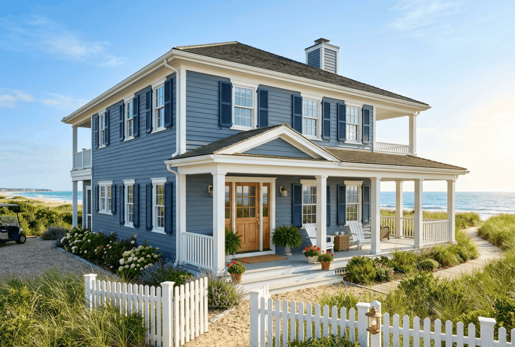
Slate blue is a cool, muted blue-grey that feels serene and upscale. It’s perfect for beach houses, colonial revivals, and farmhouse styles. Pair with navy blue shutters and bright white trim for depth without chaos. The two blues (one light, one dark) create monochromatic harmony, while white window sashes and corner boards keep everything crisp. A natural wood front door or a glossy coral door adds unexpected warmth. This palette reads as coastal but not kitschy especially with grey or white stone details.
Tips
- Use the same slate blue on porch ceilings (a Southern tradition to ward off spirits).
- Keep roofing light grey or silver to balance the cool tones.
- Add white rocking chairs and blue-and-white planters on the porch.
8: Buttermilk Yellow with Chocolate Brown Trim
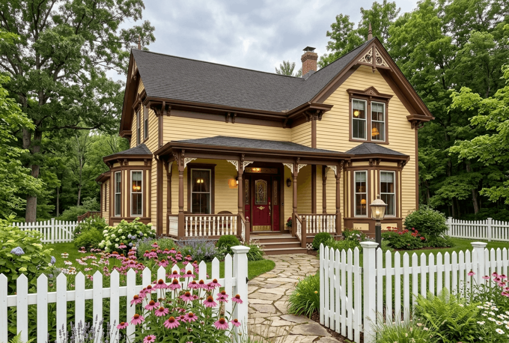
Buttermilk yellow is cheerful without being neon. It’s a historic color choice for Victorian, Queen Anne, and farmhouse exteriors, radiating warmth and hospitality. Pair with chocolate brown or espresso trim on brackets, porch spindles, and window headers to ground the brightness. A deep red or forest green front door adds another layer of heritage charm. This look thrives on sunny streets and wooded lots alike. Use cream or beige for any large garage doors to avoid a heavy appearance.
Tips
- Test buttermilk yellow in full sun it lightens significantly compared to the paint chip.
- Use brown sparingly (just trim) to avoid a “chocolate box” look.
- Landscape with purple salvia or blue hydrangeas for complementary colour contrast.
9: Snow Grey with Black Window Frames
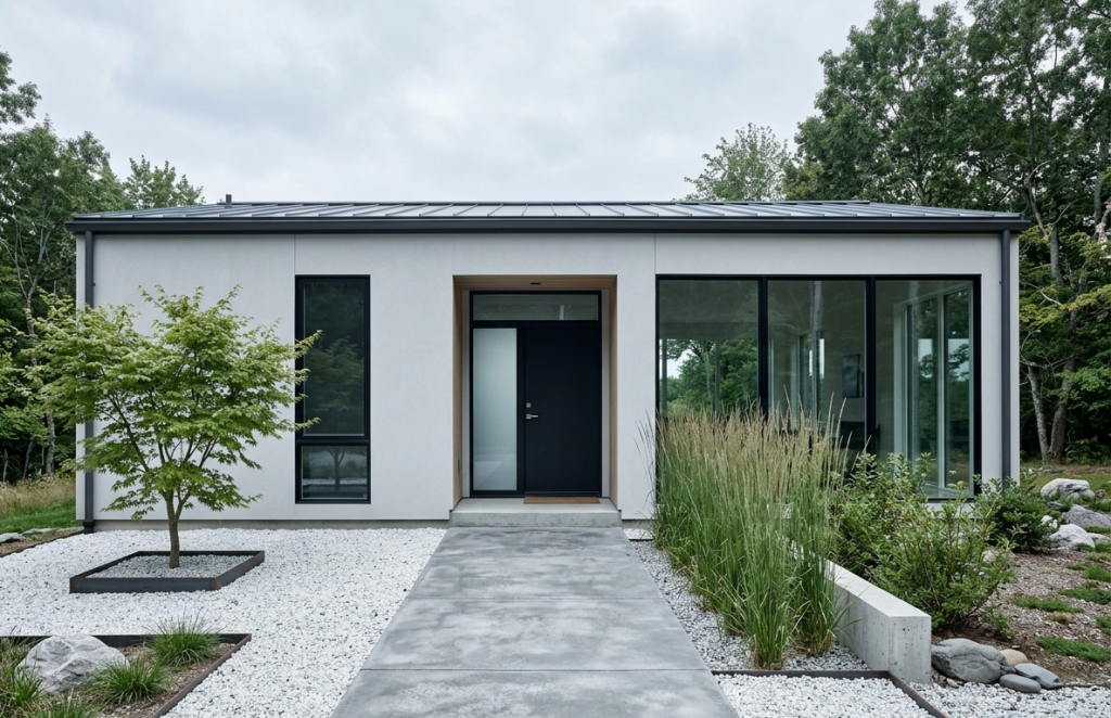
Snow grey is a pale, almost-white grey with cool undertones. It feels modern, clean, and minimalist. Pair with matte black window frames, black gutters, and a black front door for a sleek, high-contrast look. This palette excels on contemporary, Scandinavian, and industrial-style homes. Because the base is light, the house reflects heat and looks airy, while black elements provide graphic definition. Use raw wood or concrete for driveway and walkways to reinforce the modern feel. Add a single bright accent like a teal planter or yellow bench.
Tips
- Choose flat or matte finish on siding to reduce glare.
- Keep landscaping minimal: ornamental grasses, black river rocks, and one sculptural tree.
- Use large-format house numbers in brushed nickel or white.
10: Dusty Rose with Cream Trim
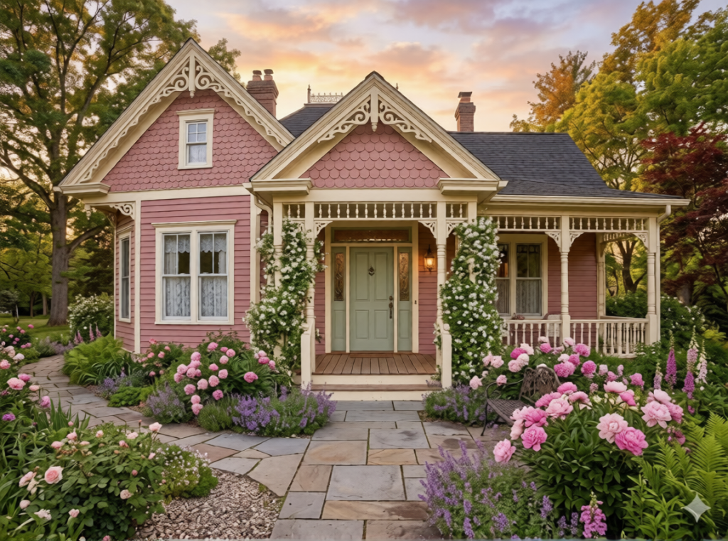
Dusty rose is unexpected, romantic, and surprisingly versatile. It works beautifully on Victorian cottages, stucco bungalows, and eclectic homes. The muted pink has grey undertones, so it never feels childish. Pair with cream or warm white trim, and consider a soft sage green front door or a charcoal grey one for balance. Dusty rose looks incredible with natural stone chimney work, copper gutters, and climbing vines. It also glows softly in sunset light and feels distinctive without shouting.
Tips
- Keep the roof a neutral grey or brown avoid black or red.
- Use cream or beige for large surfaces like garage doors.
- Plant white roses or pink peonies to mirror the home’s softness.
Conclusion
Your home’s exterior colour is one of the most expressive and permanent design choices you’ll make. Whether you lean toward bold navy, earthy olive, or romantic dusty rose, the right palette should honour your home’s architecture, your neighborhood’s character, and your personal taste. Remember to test samples on different sides of your house, consider your roof and landscaping, and invest in quality paint and prep work. Ready to transform your curb appeal? Pick your favourite from these ten ideas, grab some sample quarts, and watch your home’s personality come alive.
FAQs
How do I choose the right exterior color for my house style?
Start with your home’s architecture. Colonial and Victorian homes often suit historic palettes (buttermilk yellow, sage green, navy). Mid-century modern and contemporary homes look great with charcoal, snow grey, or warm white. Craftsman and bungalows shine with olive green, terracotta, or dusty rose. Also consider fixed elements: roof color, stonework, and brick won’t change, so choose siding colors that harmonize rather than clash.
Should I paint my front door a different color?
Absolutely. An accent front door is one of the easiest ways to add personality. For neutral houses (white, grey, beige), try yellow, red, or navy. For colorful siding (navy, olive, terracotta), choose a door in a lighter or darker shade of the same family, or a complementary color like mahogany wood or deep coral. Just ensure the door color appears elsewhere (a planter, house numbers, or wreath) so it feels intentional.
How many exterior colors should I use?
The standard rule of thumb is three maximum: a main body color, a trim color (windows, eaves, corners), and an accent color (front door, shutters, or garage door). Some simple modern homes use just two (body + trim) while ornate Victorians might use four or five on small details. More than three can look busy unless your home has many architectural sections to separate them. When in doubt, stick to three.