17 Chic Kitchen Colour Ideas
Feeling stuck with a boring, uninspired kitchen? You’re not alone. The kitchen is the heart of the home, but choosing the right color scheme can feel overwhelming. Do you play it safe with white or take a risk with emerald green? The good news: you don’t need a full remodel to make a massive impact. A fresh coat of paint or new cabinet color can change everything. In this guide, we explore 17 chic kitchen color ideas that balance style and practicality. so you can visualize the look instantly. Let’s turn your kitchen into a space you truly love.
1: Soft Sage Green & Cream

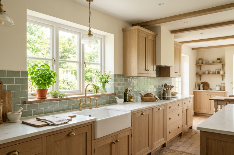
Sage green has become a modern classic for a reason. It’s calming, natural, and pairs beautifully with warm cream tones. Use soft sage on lower cabinets or an island, then keep upper cabinets cream or off-white. This combination works wonders in small or dark kitchens because it reflects light without feeling stark. Add natural wood floating shelves and a few potted herbs to enhance the earthy vibe. The result is a fresh, airy kitchen that feels both chic and lived-in.
Tips
- Use matte finishes for a soft, organic look.
- Pair with brushed brass or nickel handles for warmth.
- Add a cream zellige tile backsplash for texture.
2: Deep Navy Blue & White
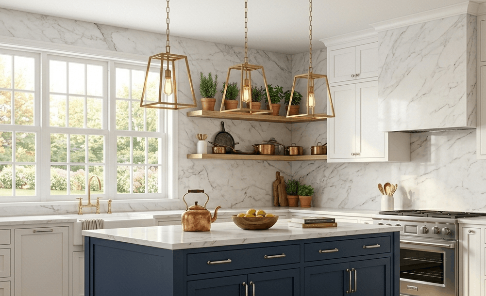
Nothing says sophisticated chic like deep navy blue paired with crisp white. Navy anchors the space, making it feel grounded and elegant, while white keeps it from feeling too heavy. Try navy on the base cabinets or a large kitchen island, with white perimeter cabinets and walls. The contrast creates a striking, tailored look that works in traditional and contemporary homes alike. Add polished nickel or gold hardware for extra polish.
Tips
- Choose a navy with subtle blue undertones (not too purple).
- Use a high-gloss finish on navy to reflect light.
- Introduce a white marble backsplash to bridge both colors.
3: Warm Terracotta & Beige
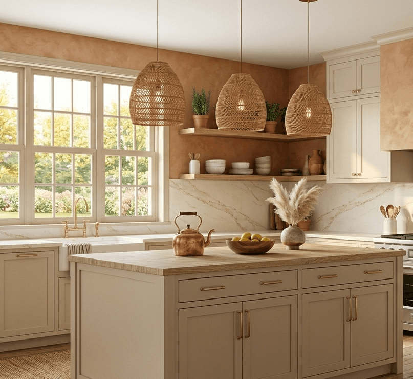
Terracotta is bold but welcoming. This earthy, warm reddish-brown brings Mediterranean charm and coziness to any kitchen. Balance terracotta walls or a feature backsplash with soft beige cabinets and light oak flooring. The key is moderation use terracotta as an accent, not the whole room. The combination feels organic, sunny, and perfect for homes that want personality without screaming for attention.
Tips
- Use limewash paint for terracotta walls to add texture.
- Pair with cane-webbing barstools or rattan pendants.
- Keep countertops light (creamy quartz or travertine).
4: Charcoal Grey & Blush Pink
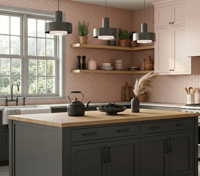
This unexpected duo is for the bold decorator. Charcoal grey adds drama and depth, while blush pink softens the entire space. Try charcoal on lower cabinets or a floor-to-ceiling pantry wall, with blush pink on upper cabinets or a tiled backsplash. The contrast is modern, playful, and surprisingly livable. Use matte black fixtures and warm wood accents to ground the palette.
Tips
- Keep blush pink very pale (almost peach) for best results.
- Use unlacquered brass handles to add warmth.
- Add a large black-framed window to balance dark tones.
5: Butter Yellow & Off-White

Butter yellow is cheerful without being childish. This soft, creamy yellow brings instant warmth and sunshine to north-facing kitchens. Pair it with off-white cabinets and white oak butcher block counters for a cozy, cottage-inspired look. Use butter yellow on the island or a single wall of cabinetry to keep the space feeling fresh. The result is uplifting and timeless.
Tips
- Choose yellow with warm, not neon, undertones.
- Pair with linen roman shades for softness.
- Add blue or green glass accents for contrast.
6: Jet Black & Warm Wood
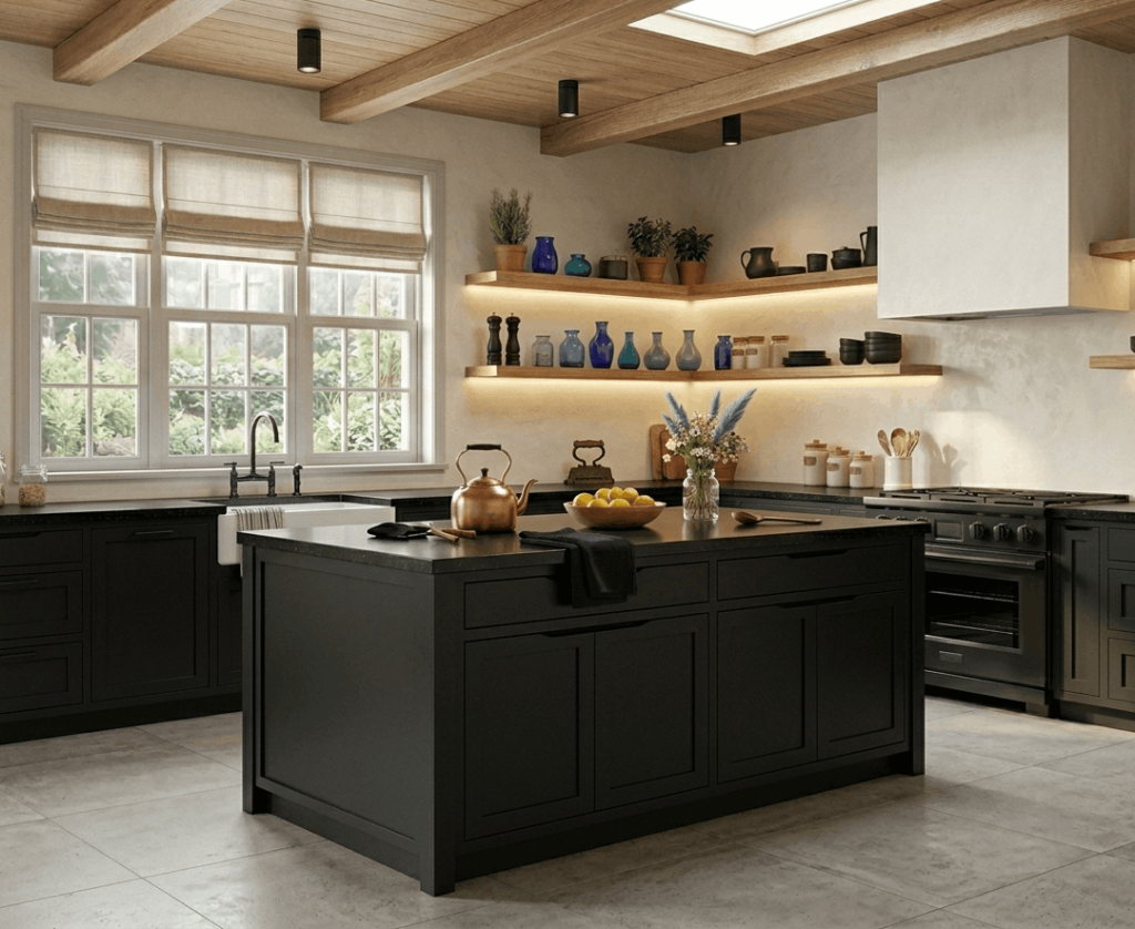
All-black kitchens sound daring, but when paired with warm wood, they become ultra-chic. Use jet black on lower cabinets and the range hood, then bring in light or medium oak for floating shelves and barstools. A white or light grey wall prevents the room from feeling like a cave. The look is modern, dramatic, and surprisingly welcoming perfect for industrial or minimalist spaces.
Tips- Use a matte finish on black cabinets to hide fingerprints.
- Add under-cabinet lighting to prevent dark shadows.
- Choose a light-colored tile floor (cream or pale grey).
7: Dusty Blue & Creamy White

Dusty blue is a softer, more romantic take on classic blue kitchens. It feels vintage, relaxed, and endlessly chic. Pair dusty blue cabinets (upper and lower) with creamy white countertops and a simple white subway tile backsplash. The palette is soothing and works beautifully in both farmhouse and coastal kitchens. Add unlacquered brass hardware that will patina over time for extra character.
Tips
- Use dusty blue on both upper and lower cabinets for cohesion.
- Add seagrass baskets for texture.
- Keep window treatments sheer and white.
8: Olive Green & Cream

Olive green is earthy, rich, and understated. It pairs perfectly with cream to create a kitchen that feels like a peaceful retreat. Use olive green on lower cabinets and a range hood, with cream on upper cabinets and walls. The look is organic and works well with natural stone counters (limestone or travertine). Add black iron hardware and a few leather pulls for a rustic-modern edge.
Tips
- Choose olive green with yellow-brown undertones.
- Use a tumbled marble backsplash for texture.
- Add a large live-edge wood cutting board as decor.
9: Lavender & Light Grey

Lavender is unexpected but incredibly chic when done right. Use a very pale, greyed-out lavender on an accent wall or island, then pair with light grey cabinets and white counters. This palette is soft, serene, and works wonderfully in eclectic or bohemian kitchens. Avoid bright purple at all costs think dried lavender, not candy.
Tips
- Test lavender samples under your kitchen lighting first.
- Pair with natural linen and raw wood.
- Use chrome or stainless steel for a clean contrast.
10: Chocolate Brown & Off-White
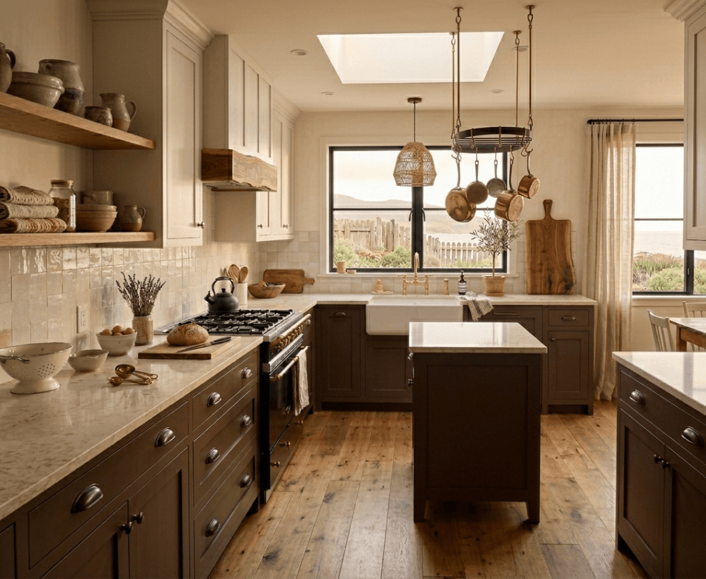
Chocolate brown is making a quiet comeback. It’s warm, rich, and deeply cozy. Use chocolate brown on lower cabinets or a butler’s pantry, then keep the rest of the kitchen off-white or cream. The contrast feels classic and country-chic. Pair with unlacquered brass or oil-rubbed bronze hardware, and consider a zellige tile backsplash for handmade texture.
Tips
- Use brown with red or warm undertones, not grey.
- Keep upper cabinets light to avoid a closed-in feeling.
- Add a copper pot rack for warmth.
11: Seafoam Green & White

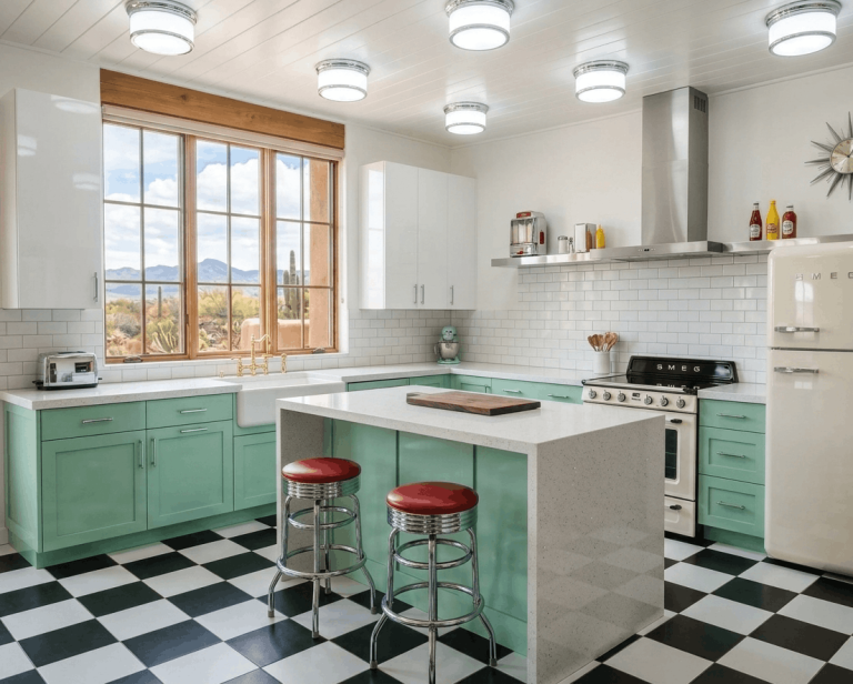
Seafoam green is a pale, slightly greyed green-blue that feels like a breath of fresh air. It’s retro but modern at the same time. Use seafoam on all cabinets (upper and lower) for a unified look, then break up the space with white marble counters and a simple white backsplash. The effect is clean, cool, and incredibly relaxing ideal for beach cottages or mid-century homes.
Tips
- Choose a seafoam with more green than blue.
- Use warm wood flooring to balance the cool tone.
- Add a few brass accents for a subtle glam touch.
12: Burgundy & Cream
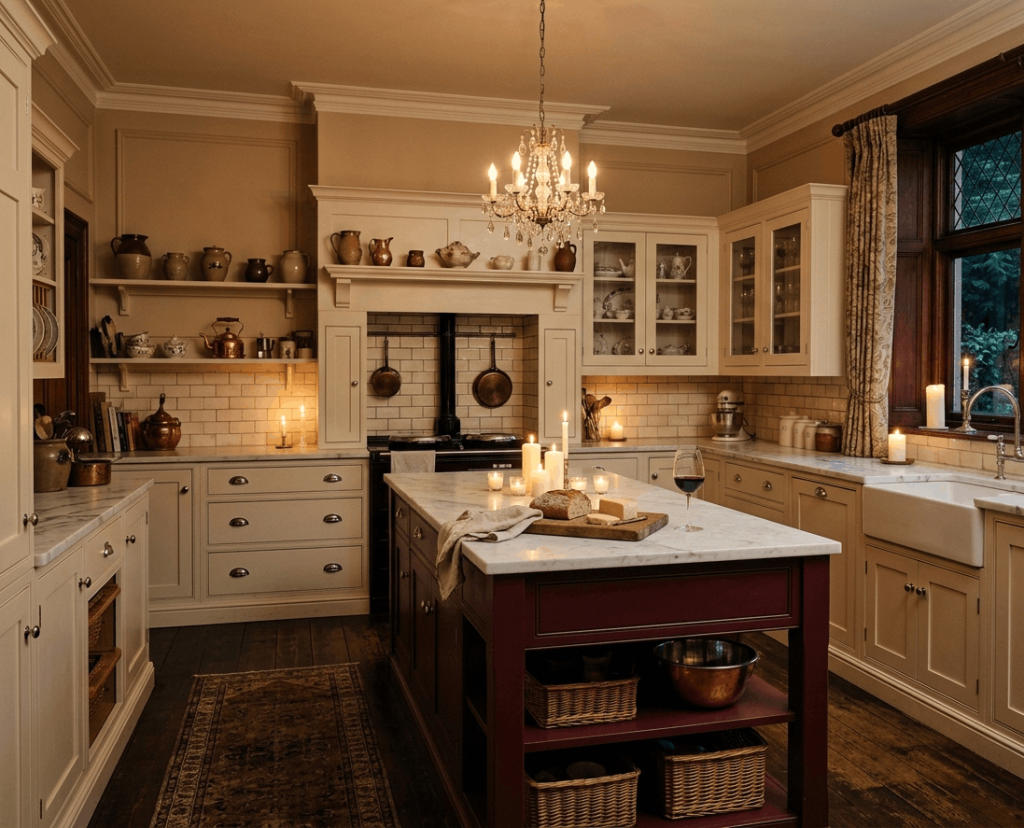
Burgundy is bold, luxurious, and deeply warm. Use it sparingly on a kitchen island or a lower bank of cabinets paired with cream walls and upper cabinets. This rich red-purple hue feels intimate and elegant, perfect for traditional or Victorian-inspired kitchens. Keep hardware simple (polished nickel or chrome) and add a white marble or quartz countertop to reflect light.
Tips
- Use burgundy only on one element to avoid overwhelming.
- Pair with cream, never bright white.
- Add fresh flowers in white or pale pink to soften.
13: Warm White & Natural Oak
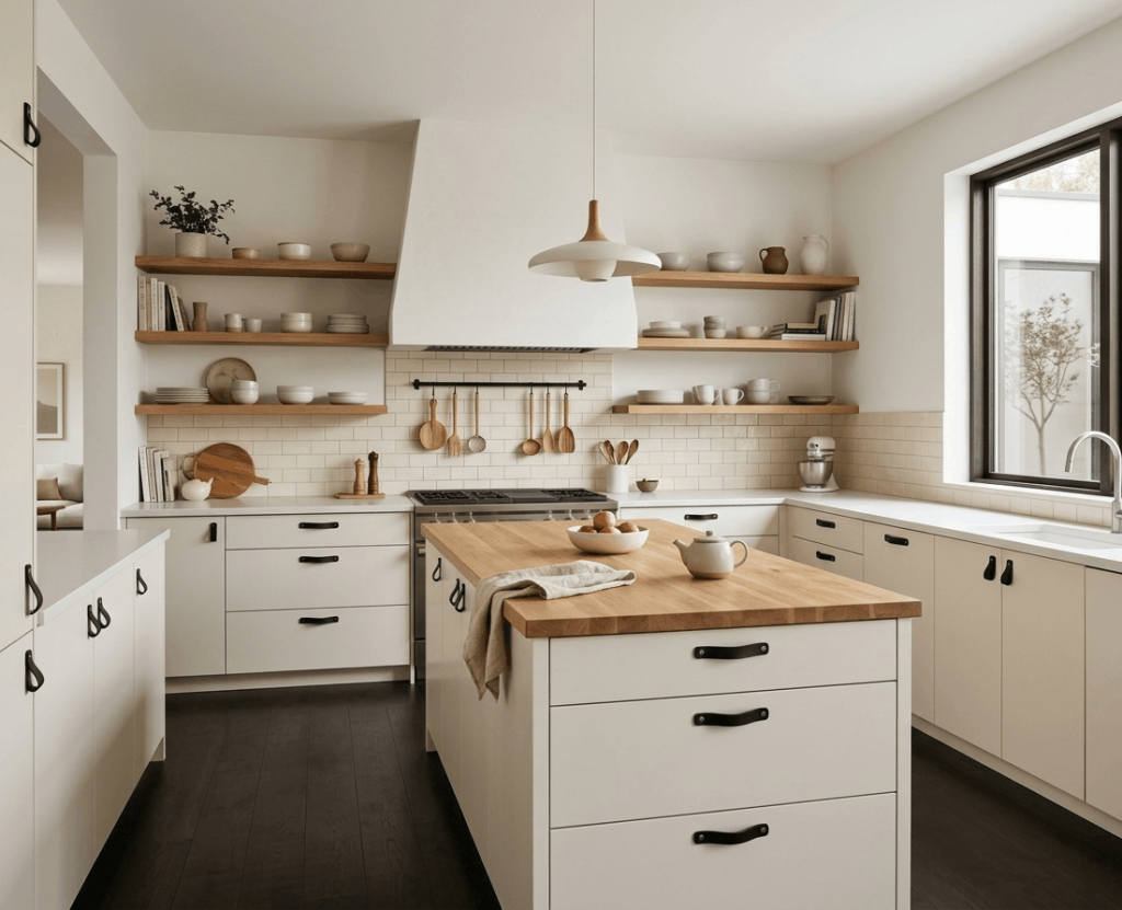
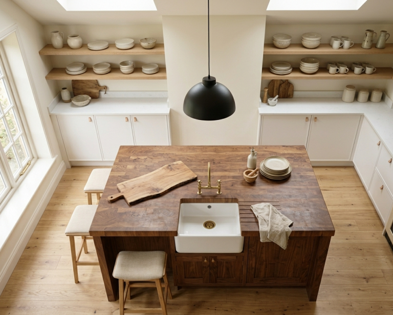
Sometimes the chicest choice is the simplest. Warm white cabinets paired with natural oak open shelving and accents create a light, Scandinavian-inspired kitchen. The key is texture: use matte white painted cabinets, raw oak shelves, and a white plaster hood. The palette feels clean, calm, and endlessly versatile. Add black or leather pulls for subtle contrast.
Tips
- Choose white with yellow or beige undertones (not stark blue-white).
- Use oak for the range hood or floating shelves.
- Add a live-edge oak or walnut cutting board.
14: Midnight Blue & Brass

Midnight blue is navy’s dramatic cousin. It’s darker, richer, and almost black in low light. Use it on lower cabinets or a statement pantry wall, then pair with brass hardware and a creamy white upper cabinet. The blue-and-brass combination feels regal and moody, perfect for evening entertaining. Add a white marble or light quartz countertop to keep things balanced.
Tips
- Use glossy finish on midnight blue to catch light.
- Choose unlacquered brass for a vintage patina over time.
- Keep walls very light (almost white) to avoid darkness.
15: Pale Pink & Walnut

Pale pink (almost blush) feels fresh and modern when paired with rich walnut wood. Use pale pink on upper cabinets or a tiled backsplash, then ground the space with walnut lower cabinets or a walnut island. The combination is soft yet masculine, sweet yet sophisticated. Keep countertops white or light grey, and use matte black hardware for edge.
Tips
- Choose pink with grey undertones (not bubblegum).
- Use walnut with a natural, matte finish.
- Add a single black pendant light for contrast.
16: Teal & Bright White

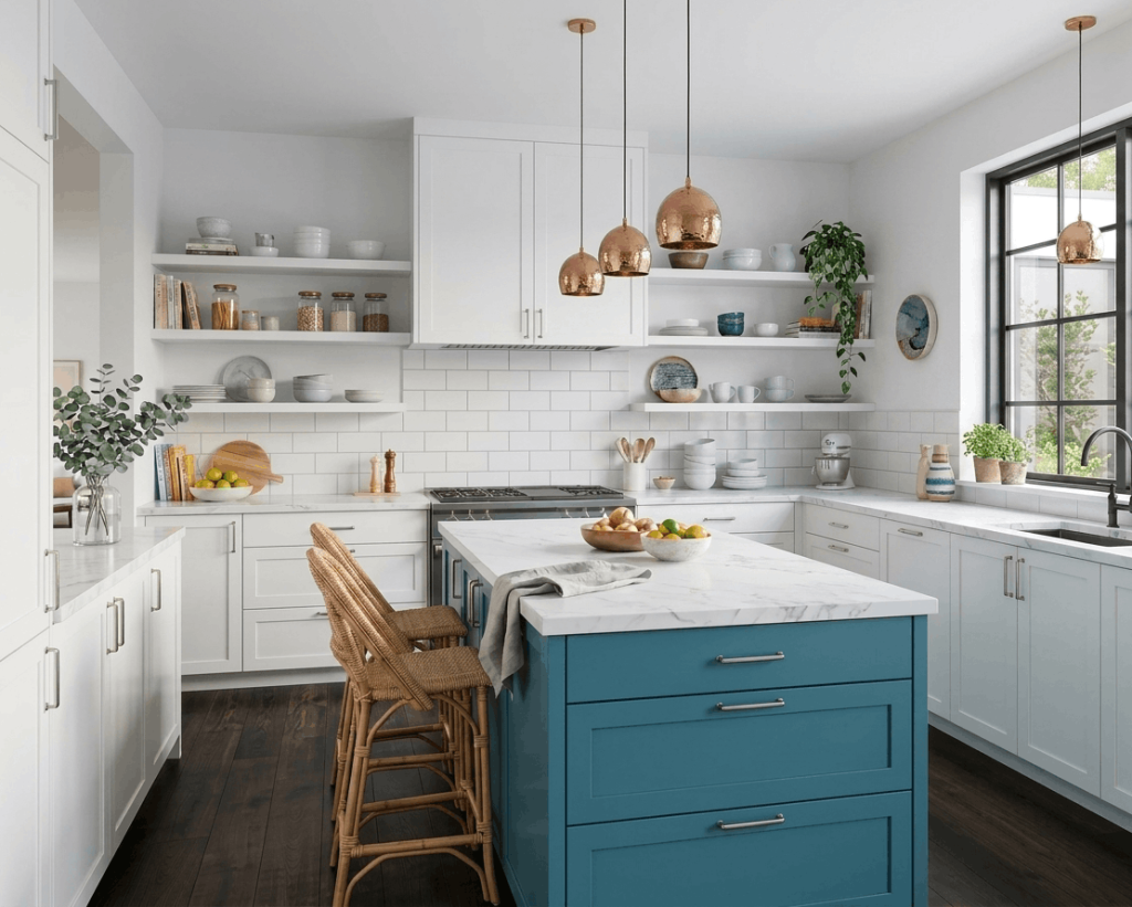
Teal is bold, lively, and full of personality. Use it on a kitchen island or a single run of cabinets, then surround it with bright white walls and white perimeter cabinets. The contrast is sharp, clean, and incredibly chic. Teal works best in contemporary or eclectic kitchens. Add brushed nickel or chrome hardware, and keep the backsplash simple (white subway or marble).
Tips
- Choose a teal with more blue than green for sophistication.
- Use teal on a vent hood for a surprise pop.
- Add copper or warm wood accents to balance the cool tone.
17: Greige (Grey-Beige) & White
Greige is the ultimate neutral it’s not too warm, not too cool. Use greige on all cabinets (upper and lower) for a seamless, sophisticated look. Pair with pure white countertops and a white backsplash. The palette is understated, elegant, and works with any style from modern to traditional. Add texture with natural wood floors and woven shades.
Tips
- Choose a greige with 60% grey and 40% beige.
- Use matte finish on cabinets for a soft look.
- Add black or aged brass hardware for definition.
Conclusion
Choosing the right kitchen color doesn’t have to be stressful. From soft sage and dusty blue to bold navy and warm terracotta, these 17 chic kitchen color ideas prove there’s a perfect palette for every taste. Start small paint just an island or a single wall and see how the color feels in your space. Which idea will you try first? Let us know in the comments below, and don’t forget to pin your favorite image prompt for later.
FAQs
What is the most popular kitchen color for 2025?
Soft sage green and warm white remain top choices for 2025. Homeowners are leaning toward calming, nature-inspired hues that feel timeless but fresh. Greige (grey-beige) is also growing in popularity for its understated versatility.
Should I paint my kitchen cabinets or replace them?
If your cabinets are structurally sound, painting is a cost-effective, high-impact update. Use quality cabinet paint and proper prep work. Replacement makes sense only if the layout doesn’t work for you or the boxes are damaged.
How do I choose a kitchen color that won’t date quickly?
Stick with classic neutrals (cream, greige, warm white) or earthy tones (sage green, olive, dusty blue). Avoid ultra-trendy neons or high-contrast patterns on large surfaces. Instead, use trendy colors on small accents like walls or accessories.